Wednesday, 14 December 2011
Q 6
Through out the making of my magazine i used many resources to product it. Such as photoshop, cameras and blogger to keep people up to date with my process. First of all i used a cannon camera to get my photos then edited them on photoshop changing the levels and brightness/contrast. Then I used photoshop to start producing my magazine usig the fill tool to make the background, different coloured text using different fonts, use the shape tool to produce shapes and more. I also used blogger to show my processes and research to help me design my own magazine.
Q 3


What kind of media institution might distribute your media product and why?
I think that kerrang magazine edited by Nichola Browne who has been editing kerrang magazines since 2009 is similar to my magazine. Things such as a simple layout are used in both mine and kerrang magazines. Also shapes to highlight key information and perfectly edited photos are used. Also they use issue numbers for every issue of the magazine so they are easy to collect, this is also used in my magazine. Also on the cover things such as win is also used which is the same as my magazine. I think this makes the viewer/buyer more interested in your magazine, which would hopefully increase sales.
Q7

I have improved on the software I use to create my magazine as my preliminary task was produced on publish because I didn’t know a lot about Photoshop. I can now confidently use Photoshop and most of its tool such as dropping effects onto the writing. I have also learnt how to work with layers on Photoshop making the finish of my magazine at a high standard. I have also learnt how to edit picture for a perfect finish, including using the healing tool and brightness/contrast. I also used things such as the shape tool and other tools.
Q5
How did you attract/address your audience?
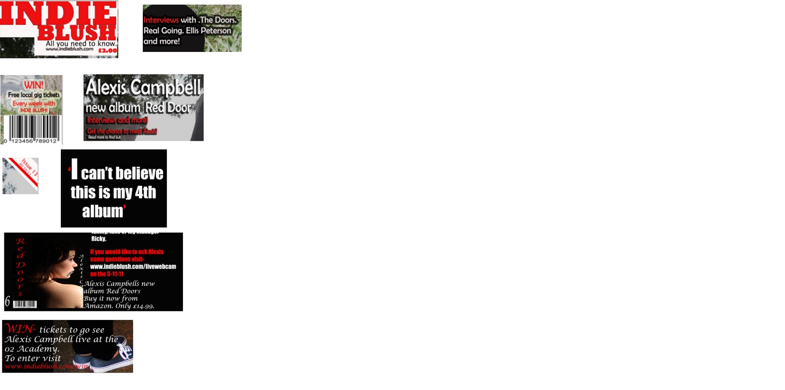
I have used contrasting colours, red, white and black, to stand out from my background making it easy for the reader to read and notice when it is on a shelf in a shop (making it stand out). The main image on the front cover is used to show an indie artist to address the type of music my magazine is based around. The reader is aware of the indie artist by the clothes she is wear, for example her shoes are vans which is classed as indie. Also her dark hair and make-up show a rock side. Using catchy sub-headings make the reader want to read on and find out more about the story, this increases the sales. By adding ‘WIN local gig tickets’ makes the reader feel involved with the magazine and makes them want to buy the magazine to get involved. Also using a catchy name ‘Indie Blush’ automatically makes the reader attract to the magazine. Also interviews with artists, Alexis Campbell, increases the amount of people interested in the magazine as they will get all the gossip about the artist and what they have been up to before anyone one else.
Q4
Who would be the audience for your media product?
The audience of my magazine, Indie Blush, could be people who like indie music and people who are interested in indie artists. People that like to keep up to date with the indie music industry would like to read my magazine because it keeps the reader updated with the latest music news. Also people who visit nightclubs that play indie music will also like to read my magazine because it would keep them up to date with the latest music being released. I think that people between the age of 15-19 are most likely to read my magazine because indie is the latest, most listened too genre of music for this age group.
Name: Devon Perry
Age:16
College: Shiney Rowe
Interests: Spending time with friends, keeping up with the latest music, listening to the latest music, trying different things out with her hair/makeup, keeping up with the latest trends but also making her own clothes
What she spends money on: I-tunes, music magazines, nandos, subways, clothes, hair dye, new make up, nail varnish
Favourite type of music: Indie/Rock
Favourite places to shop: topshop, vintage shops
What makes you want to read/buy Indie Blush: the photo used as it looks like someone I would listen to. Also the headings showing what is featured in the magazine, makes me want to buy it to find out more. Also the name as it sounds catchy and flows. I also like the colours used as they stand out. It would catch my eye if it was on a shelf along with other indie rock magazine because of use of colour, making the title standout. This makes it easy to read and makes it stand out from the background and the rest of the magazines, due to the box around the title.

Q 2

Using a main image of a model sitting down gives a laid back feeling of the magazine, not pushing you to be like anyone just be yourself. Also even though there is a few sub-headings on both of the covers it is easy to read and follow who the main image is and what the stories are. Also both titles are simple but Indie Blush has a slogan and Vogue doesn’t. I think that by having a slogan it gives the magazine a personal touch from the producer and also gives an insight of what the aim of the magazine is. Also by putting the magazine name into a box helps empathise that that is the magazine name and also makes it sound out from the background. Both models have similar facial expressions both using straight faces but the one in vogue is looking at the camera and the one in y magazine is looking away. Because my model is wearing vans, skinny jeans, dark make up and dark hair people will automatically think that is an indie/rock magazine because of the things she is wearing.
Q1
1. In what way does your media product use, develop or challenge forms and conventions of real media products?
The title of my magazine Indie Blush informs the reader/viewer that the magazine is an indie magazine. It also looks like things that are on the market at the minute such as Q magazine. My magazine uses similar fonts and colours as Q magazine, they are also both indie magazine. What mine original is the slogan that I have added under the title of my magazine.
Similar to kerrang magazine, a rock magazine, on my front cover it features ‘win free local gig tickets’. This makes my magazine more realistic and helps get the viewer to be more interested.
As the model on my cover is wearing vans, skinny jeans, a band t-shirt and also wearing dark makeup along with her dark hair the viewer know that it is an indie/rock magazine, magazines such as kerrang, Q and NME also do this. Also the way she posted shows that she is laid back and doesn’t really care what people think about her or how she dresses. The people who read my magazine will also have this logic.
The mast head gives a slight clue or hint of what is going to be in the magazine making the reader want to read on and find out more. Mostly all of magazines on the market do this this to increase sales. Also the lay out of the magazine is simple making it easy to read, similarly to OK magazine and more.
Using circles to make things stand out are usually used in pop magazines such as pop. By making it a dark colour it goes with the indie theme. It also makes what is inside of the shape stand out from the background.
By adding an issue number and date also makes it seems realistic. Kerrang magazine also does issue numbers so you can makes sure you are getting an issue that you haven’t already got and also keeping in track of what issues you are getting, in order.
On the double page spread I added a picture of the artist new album just like NME does in interviews. This shows what to look for when they are looking for the latest albums. It also makes it realistic as magazines advertise things, exactly what my aim was.
Also including win tickets on the double page spread is also makes it realistic as NME and Q use this in their magazine. It makes the reader want to read on because they know they are in with a chance of winning tickets. Also by giving a link of how to apply makes it more realistic as you are giving a web address.
Over all my magazine is very similar to other indie/rock magazines such as Q, NME and kerrang because of things such as winning things and how to win things.
Subscribe to:
Comments (Atom)