1. In what way does your media product use, develop or challenge forms and conventions of real media products?
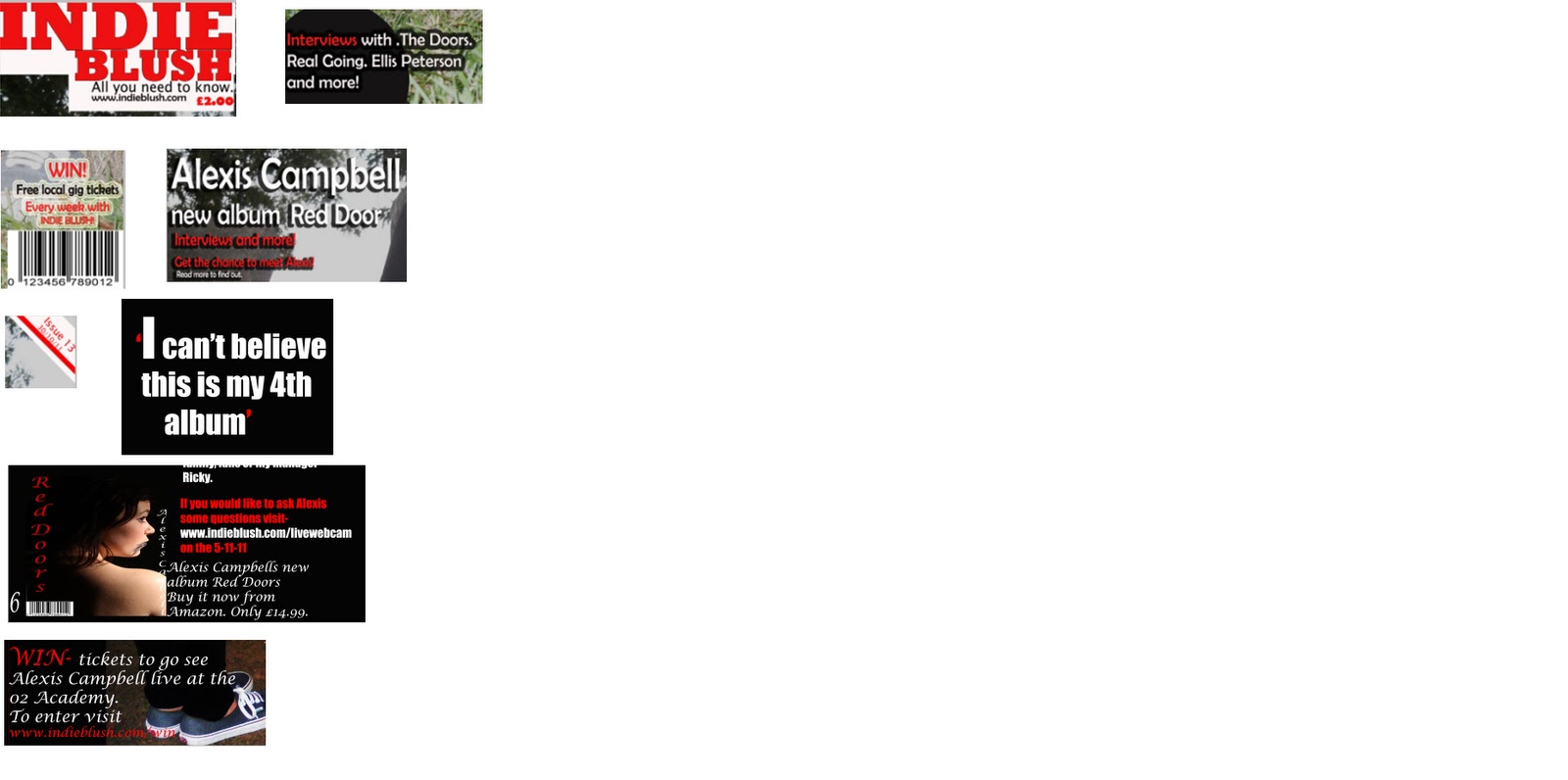
The title of my magazine Indie Blush informs the reader/viewer that the magazine is an indie magazine. It also looks like things that are on the market at the minute such as Q magazine. My magazine uses similar fonts and colours as Q magazine, they are also both indie magazine. What mine original is the slogan that I have added under the title of my magazine.
Similar to kerrang magazine, a rock magazine, on my front cover it features ‘win free local gig tickets’. This makes my magazine more realistic and helps get the viewer to be more interested.
As the model on my cover is wearing vans, skinny jeans, a band t-shirt and also wearing dark makeup along with her dark hair the viewer know that it is an indie/rock magazine, magazines such as kerrang, Q and NME also do this. Also the way she posted shows that she is laid back and doesn’t really care what people think about her or how she dresses. The people who read my magazine will also have this logic.
The mast head gives a slight clue or hint of what is going to be in the magazine making the reader want to read on and find out more. Mostly all of magazines on the market do this this to increase sales. Also the lay out of the magazine is simple making it easy to read, similarly to OK magazine and more.
Using circles to make things stand out are usually used in pop magazines such as pop. By making it a dark colour it goes with the indie theme. It also makes what is inside of the shape stand out from the background.
By adding an issue number and date also makes it seems realistic. Kerrang magazine also does issue numbers so you can makes sure you are getting an issue that you haven’t already got and also keeping in track of what issues you are getting, in order.
On the double page spread I added a picture of the artist new album just like NME does in interviews. This shows what to look for when they are looking for the latest albums. It also makes it realistic as magazines advertise things, exactly what my aim was.
Also including win tickets on the double page spread is also makes it realistic as NME and Q use this in their magazine. It makes the reader want to read on because they know they are in with a chance of winning tickets. Also by giving a link of how to apply makes it more realistic as you are giving a web address.
Over all my magazine is very similar to other indie/rock magazines such as Q, NME and kerrang because of things such as winning things and how to win things.
No comments:
Post a Comment